Sometimes there are some features you take for granted. Take the list view in the Calendar app for example. In iOS 6, it was pretty straightforward. You had three tabs at the bottom of the app for List, Day, and Month views. So simple, my mom could figure it out.
With the iOS 7 redesign though, some things got more complicated, or at the very least less obvious. The same list view feature that was so obvious in iOS 6 suddenly became a little more subtle. In fact, it became so subtle that some people are confused as to where it went, my mom included…
I figured that if that was confusing for a few users, it might be worth publishing a post about it, because clearly my mom and the handful of readers’ emails we received about that can’t just be isolated cases. As a matter of fact, if you use the stock Calendar app, I’m sure you’ve asked yourself the question at least once before: “where is the list view in the iOS 7 Calendar app?â€
Today, I answer this question.
Of course, if you already know the answer, please spare us the “slow news day?†and “I’ve known this for months†types of comments. If you already know this, good for you. There is no need to bring down people who don’t, including my mom, or iDB for sharing simple tips about iOS 7.
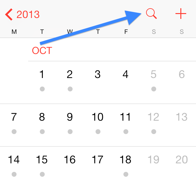
So, where is the list view in the new Calendar app? Is it gone? No, it’s just right here hiding in plain sight, except its icon isn’t the one you’re probably looking for.

Whether you are in the year, month or day view, you can tap the magnifying glass icon at any time to be taken to the list view. As I said, it’s definitely not as obvious now. To me, the magnifying glass icon is synonymous of “search,†not necessarily of list view. Note that once you are in list view, you can easily search for any event in your calendar by using the search box at the top.
A simple tip indeed, but definitely one that will help my mom and maybe yours get the best of iOS 7.
If the stock Calendar app doesn’t fit your needs, we suggest you check out these alternatives:

No comments:
Post a Comment