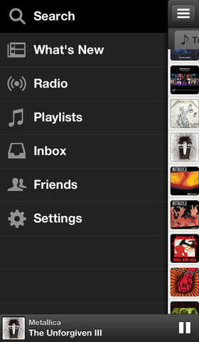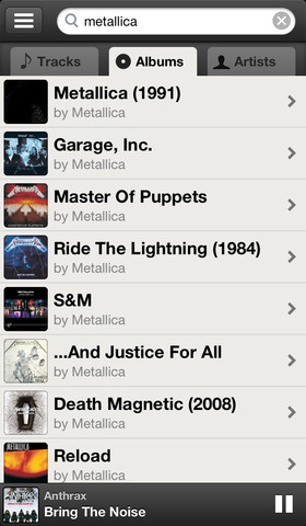

The Swedish streaming music startup Spotify has finally updated its iOS client today with a new Discover tab which made its way into the Android build back in December 2012 and four months later into the web interface.
Basically a music recommendation engine, Discover suggests similar songs based on your listening history and your playlists. Oh, and iPhone users will be happy to learn that Spotify now lets them fully customize their playlists.
This feature was previously inexplicably reserved only for the iPad client. Oh, and they just flattened the app icon so it fits better on your iOS 7 Home screen…
On the iPhone, the new Spotify version 0.7.1 lets you add or remove tracks from your playlists, as well as reorder them. And in your playlist folders, All Tracks will now show you the actual number of tracks.
The “…†context menu button has been moved to the top right of the screen, where you’d normally expect it. In another welcomed design tweak, Spotify has changed the order of search tabs on the iPhone: now it’s Artists, Albums and Tracks.
My favorite feature is a revamped Now Playing, available on both the iPhone and iPad, which no longer yanks you out of your playlist when starting a song. The new Now Playing screen also includes the Up Next queue on the iPhone.
They have a brand new icon, too.
![]()
According to release notes, the new-look Discover experience on iPhone as well as the Up Next queue are “coming soon to everyoneâ€.


The universal binary update is free on the App Store [1] . If you’re on Android, head over to Google’s Play store [2] .
Note you’ll need to be a Spotify Premium subscriber in order to use mobile apps.

No comments:
Post a Comment